POSSIBLE POINTS OF INFLUENCE:
BRANDING
With the special edition release of their eponymous debut album, Suede, their website has been rebranded with the album artwork., replacing the design template of their last studio album release, Night Thoughts.
...
The cover has been filtered in black and white, but still keeping the dream-like quality (Uses and Gratifications, Escapism) ...
OVERALL KEY RECURRENT DESIGN FEATURES
COLOUR: Black and white
SHAPES:
IMAGES:
LIKELY TARGET AUDIENCE/S; MODE OF ADDRESS
Restrained used of social media, slightly older audience
LANDING PAGE
...

Detail explaining all the contents of the special

...
HOMEPAGE LAYOUT
TOP FRAME/BANNER
....
NAME/LOGO
....
PAGES/TOP LINKS LIST
Instead of at the top of the page as the term suggests, the links are on both sides, three left on two:
These include:
AUTO-SCROLLING GALLERIES?
...
MERCHANDISE/SHOP
As is conventional, while you can see the newest releases on the website, you have to click on to a link to another site to access the full store:

...

...
E-COMMERCE
...
PRESENCE OF MUSIC
PUSHING THE NEW RELEASE

No links
TOUR DATES
GALLERY?
PERSONAL INFORMATION?
LINKS
First three are to two fan sites
The name: "Insatiable Ones", it is not uncommon for fans to call themselves a name, like "Little Monsters" with Lady Gaga. It is quite fitting as it gives the image of fans who can't get enough (pun intended).
ARCHIVE?
GAMES?
NEWS
LANGUAGE:
"Store" instead of Merch
MEMBERSHIP/SIGN-UP?
VIDEO/VINES
SOCIAL MEDIA
The Big Three on their own, the icons disappear just like the main link:

FACEBOOK:
Cropped.

TWITTER:
With the timeline photo being wider and thinner, the image has been cropped even more.

INSTAGRAM:
Hasn't being updated:

..
OTHER EXTERNAL AGENCIES
...
FONTS + FONT VARIATION
...
BEST + WORST FEATURES
...
FAULTY/OUT-DATED CONTENT?
Some elements still haven't been quite updated to the new release.
...
- Make my website more attractive to a 15-25 audience
- In the social media, address the fans as "Our Insatiable Ones"
BRANDING
With the special edition release of their eponymous debut album, Suede, their website has been rebranded with the album artwork., replacing the design template of their last studio album release, Night Thoughts.
 |
| Last website design |
 |
| Current design |
The cover has been filtered in black and white, but still keeping the dream-like quality (Uses and Gratifications, Escapism) ...
OVERALL KEY RECURRENT DESIGN FEATURES
COLOUR: Black and white
SHAPES:
IMAGES:
LIKELY TARGET AUDIENCE/S; MODE OF ADDRESS
Restrained used of social media, slightly older audience
LANDING PAGE
...

Detail explaining all the contents of the special

...
HOMEPAGE LAYOUT
TOP FRAME/BANNER
....
NAME/LOGO
....
PAGES/TOP LINKS LIST
Instead of at the top of the page as the term suggests, the links are on both sides, three left on two:
These include:
- LIVE DATES
- LINKS
- STORE
- DISCOGRAPHY
- VIDEOS
AUTO-SCROLLING GALLERIES?
...
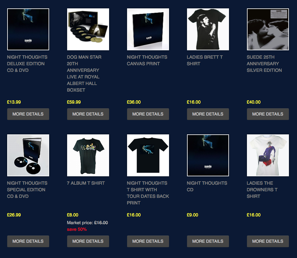
MERCHANDISE/SHOP
As is conventional, while you can see the newest releases on the website, you have to click on to a link to another site to access the full store:

...
...
E-COMMERCE
...
PRESENCE OF MUSIC
PUSHING THE NEW RELEASE

No links
TOUR DATES
GALLERY?
PERSONAL INFORMATION?
LINKS
First three are to two fan sites
The name: "Insatiable Ones", it is not uncommon for fans to call themselves a name, like "Little Monsters" with Lady Gaga. It is quite fitting as it gives the image of fans who can't get enough (pun intended).
ARCHIVE?
GAMES?
NEWS
LANGUAGE:
"Store" instead of Merch
MEMBERSHIP/SIGN-UP?
VIDEO/VINES
SOCIAL MEDIA
The Big Three on their own, the icons disappear just like the main link:

FACEBOOK:
Cropped.

TWITTER:
With the timeline photo being wider and thinner, the image has been cropped even more.

INSTAGRAM:
Hasn't being updated:

..
OTHER EXTERNAL AGENCIES
...
FONTS + FONT VARIATION
...
BEST + WORST FEATURES
...
FAULTY/OUT-DATED CONTENT?
Some elements still haven't been quite updated to the new release.
...
No comments:
Post a Comment