Showing posts with label indie rock. Show all posts

Wednesday, 28 March 2018

WEBSITE RESEARCH: Original Artist

POSSIBLE POINTS OF INFLUENCE:
  • Make my website more attractive to a 15-25 audience
  • In the social media, address the fans as "Our Insatiable Ones"


BRANDING
With the special edition release of their eponymous debut album, Suede, their website has been rebranded with the album artwork., replacing the design template of their last studio album release, Night Thoughts.


Last website design
...


Current design

The cover has been filtered in black and white, but still keeping the dream-like quality (Uses and Gratifications, Escapism) ...


OVERALL KEY RECURRENT DESIGN FEATURES 
COLOUR: Black and white
SHAPES: 
IMAGES: 

LIKELY TARGET AUDIENCE/S; MODE OF ADDRESS 
Restrained used of social media, slightly older audience


LANDING PAGE 
...


Detail explaining all the contents of the special


...


HOMEPAGE LAYOUT  


TOP FRAME/BANNER 
....


NAME/LOGO 
....

PAGES/TOP LINKS LIST 
Instead of at the top of the page as the term suggests, the links are on both sides, three left on two:

These include:

  • LIVE DATES
  • LINKS
  • STORE
  • DISCOGRAPHY
  • VIDEOS


AUTO-SCROLLING GALLERIES? 
...

MERCHANDISE/SHOP 
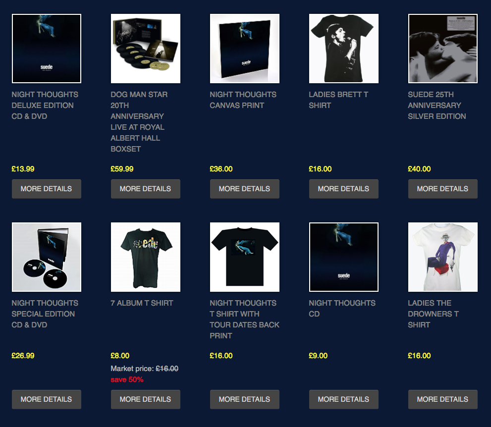
As is conventional, while you can see the newest releases on the website, you have to click on to a link to another site to access the full store:

...


...

E-COMMERCE 
...

PRESENCE OF MUSIC 
PUSHING THE NEW RELEASE


No links 

TOUR DATES


GALLERY?


PERSONAL INFORMATION? 


LINKS 
First three are to two fan sites
The name: "Insatiable Ones", it is not uncommon for fans to call themselves a name, like "Little Monsters" with Lady Gaga. It is quite fitting as it gives the image of fans who can't get enough (pun intended).


ARCHIVE? 


GAMES? 


NEWS


LANGUAGE:
"Store" instead of Merch

MEMBERSHIP/SIGN-UP? 


VIDEO/VINES 


SOCIAL MEDIA 
The Big Three on their own, the icons disappear just like the main link:

FACEBOOK:
Cropped.


TWITTER:
With the timeline photo being wider and thinner, the image has been cropped even more.


INSTAGRAM:
Hasn't being updated:

..


OTHER EXTERNAL AGENCIES 
...

FONTS + FONT VARIATION 
...

BEST + WORST FEATURES 
...

FAULTY/OUT-DATED CONTENT? 
Some elements still haven't been quite updated to the new release.

...

Friday, 2 March 2018

WEBSITE General + Indie Genre Conventions Summary

...

WEBSITE Indie Genre EG: Yeah Yeah Yeahs

POSSIBLE POINTS OF INFLUENCE:
  • Use of colour
  • Influence of album artwork on website design


ACT: Yeah Yeah Yeahs                          (website link)
TENURE: 2000 - present
CATALOGUE: 4 albums 
GENRES: Indie rock, art rock,
                    dance rock
LABELS: Touch and Go, Wichita,                                Interscope, Fiction, 
                    Modular, Polydor


BACKGROUND:
A female-fronted trio from Ohio, consisting of vocalist + pianist Karen O, guitarrist and keyboardist Nick Zinner and drummer Brian Chase, they take influence frum multiple rock subgenres such as post-punk, garage punk, dance-punk.
After a hiatus started in 2013, they have recently announced new material with a compilation album.


BRANDING
With the special edition release of their debut album, Fever To Tell, their website has been rebranded with the album artwork.

...


...


OVERALL KEY RECURRENT DESIGN FEATURES 
COLOUR: 
SHAPES: 
IMAGES: 

LIKELY TARGET AUDIENCE/S; MODE OF ADDRESS 


LANDING PAGE 
...


HOMEPAGE LAYOUT  


TOP FRAME/BANNER 
....


NAME/LOGO 
....

PAGES/TOP LINKS LIST 


AUTO-SCROLLING GALLERIES? 
...

PAGE TYPE: MERCHANDISE/SHOP 
...

E-COMMERCE 
...

PRESENCE OF MUSIC 
...

TOUR DATES


GALLERY?


PERSONAL INFORMATION? 


CONTACTS/ACT LINKS? 


ARCHIVE? 


GAMES? 


NEWS


LANGUAGE:
...

MEMBERSHIP/SIGN-UP? 


VIDEO/VINES 


SOCIAL MEDIA 


OTHER EXTERNAL AGENCIES 
...

FONTS + FONT VARIATION 
...

BEST + WORST FEATURES 
...

FAULTY/OUT-DATED CONTENT? 
Some mistake with the title for tours

...


Tuesday, 27 February 2018

GENRE CONVENTIONS

Indie rock is a subgenre of rock, rock being an umbrella genre, other subgenres include punk, heavy metal, post-rock.

ROCK
COSTUME 
Black leather jacket is often worn

PERFORMANCE
Emphasis on playing instruments. For instance, while electro pop we have the lead singer singing, we don't often see the instruments such as the keyboards, solo artists in general don't always include their backing bands in the video (David Bowie is an example who switched between the two.
So we will have solo shots of the guitar, drums, base players, keyboardists.
The singer(s) will often use a lot of facial expressions, while the instrument players often perform stoically focussing on their performance. There is a general emphasis on the lead singer, not only due to him having screen time of singing, but he may often interact more in the narrative (Final shot could be on him like in Kraftklub's Fenster).
Is becoming more and more common to include live performances with audiences, shows they have an audience.

NARRATIVE
There are videos of just performances, but it is more common to follow the cross-cutting of performance and narrative.

EDITING
Low-key lighting 


INDIE ROCK
LOCATION:
For new emerging indie rock bands are quite low budget, fits the limited resources of my coursework.
Can often be urban?

COSTUME:
Fashion sense

THEMES:
Sense of rebellion.


SOURCES:


Thursday, 22 February 2018

DIGIPAK - My Influences

not have Suede on it, as they have mostly always done and continue to do so, as well as indie acts Kraftklub, Interpol, Arctic Monkeys (numerous other      artists often also do it later when they have established their image, they can go for more artistic album artwork, Queen did this with Innuendo, Rihanna did it with Anti) Fifth Harmony continue to put themselves on their albums 

REAR COVER
Not have the length and maybe not even have a number, links that they can be played in whatever order like (so that actually is an interesting compromise with streaming culture)

or:
Really divide it like Night Thoughts was, that it has thematic and musical drifts, and thereby have them numbered.

SPINE
For artistic variety have the titles be in different colour and maybe even different case and font, as I have seen in examples like Kate Bush's Aerial.

INSIDE
Have some landscape shots of the city, need to choose what goes outside and inside. Like the landscape shots in Björk's Bastards


SOME FORM OF PROSE OR POETRY
A Sort of prequel and taster like the poem which was also featured in the trailer (could do the same with a trailer of mine). Package
Could also be very unconventional and not have the track listing on the black, and juts this letter

Then the track listing would be inside.


LYRIC BOOKLET
Each song is its own little world, with characters, like the Führerling in Sadie, Beautiful Ones remix bunch of kids? Can't Get Enough Nissi's character Attitude or Duchess the White Made-Up character 
If I can find a song about decadence, the rich, the privileged, and have really shiny photos of buildings like in Kirchberg.
Like George Michael's *Insert title* and David Bowie's Outside, but have the lyrics on the images unlike with George Michael's where they are separated.
Some of these can be gestured as short vids on Instagram and Facebook like Halsey did with Strangers. 
So generally create a fictional illusion, unlike a foreword about the Songs like in Rise Againt's Long Forgotten Songs which maintains the real world behind the songs.
Also have some landscape shots inebetween.
Should I number the pages (like I saw in Caravan's Palace)

Don't have them all vertical, have some horizontal, turned, like in Bowie's Reality, sort of done in Suede's Bloodsports. Don't make it look all neat and orderly, bit chaotic and unsettling for the fictional narrative this album has. 

Instead of having all the lyrics, have excerpts like in Lana Del Rey's Ultraviolence, without the title of the song
Then followed by 

SHOTS
High angles of buildings, to be edited in Photoshop to be cut off. 


FONTS
THE CURRENT SUEDE
Has mostly been used in white, but also in black.
I want to break away from this font, so rebrand it in a way.

ALTERNATIVES
Different simple, slightly non-serif fonts like with Kraftklub.

HONEYBLOOD - BABES NEVER DIE
Squiggly, slightly child-like font.

...


Have all the information that is usually above aside, leaves space for the tracks to go all the way down (Bowie did it with only the barcode with 1.Outside, Yeah Yeah Yeahs did with all the information:


...

Wednesday, 24 January 2018

WEBSITE - Indie Rock Merchandise Examples

POSSIBLE POINTS OF INFLUENCE:


ARCADE FIRE

Separation in to eight different sections, but not including gender like with Bring Me The Horizon. Final one not an option for me, due to there only being one album.

To see the back side:


...

...

ARCTIC MONKEYS
...

Friday, 22 December 2017

INDIE DP #5: Honeyblood - Babes Never Die

POSSIBLE POINTS OF INFLUENCE:
  • Haunting atmosphere, is a bit dystopian
  • The child-like font, could be used in some of my


ACT: Honeyblood

FULL TITLE: Babes Never Die
YEAR: 2016
TYPE OF ALBUM: Second studio album
DESIGN: ..
PHOTOGRAPHY: ...

GENRE: 

LABEL: Fatcat Records

SINGLES:


No results, shows their relatively unknown status still:


The band not on the album cover, this follows the convention of indie groups not wanting to promote themselves too much, unlike more glamorous examples of girl groups like The Spice Girls + Fifth Harmony. However, their original album, Honeyblood, did this, which is not what is always done by indie groups's debut albums, showing this convention has exceptions.

FRONT COVER

No artist logo or album title, neither the artist themselves , favouring the artwork.


BACK COVER

Right in the centre, Rule of Thirds.


Record label logo (quite quirky)
Link with the forest.
The childlike font:
Barcode below 


INSIDE
...

Tuesday, 19 December 2017

INDIE DP #4: Yeah Yeah Yeahs - It's Blitz

POSSIBLE POINTS OF INFLUENCE:
  • ...


ACT: Yeah Yeah Yeahs

FULL TITLE: It's Blitz!
YEAR: 2009
TYPE OF ALBUM: Third studio album
DESIGN: ..
PHOTOGRAPHY: ...

GENRE: Synth punk, alternative pop, indie rock
LABEL: Dress Up

SINGLES:

No results, shows their relatively unknown status still:


FRONT COVER
Artist and album title not on there, goes with the band not going there, they are not as eager as more mainstream bands and the majority of solo artists to have their image all over the branding.
Rule Of Thirds has been observed for the hand.
If this is a woman's hand, then it still enforces the hegemony of gender roles and images, and as this band has a female singer it might be assumed it's supposed to be her. 

BACK COVER
...

INSIDE
...

Saturday, 16 December 2017

INDIE DP #3: Kraftklub - Keine Nacht Für Niemand

POSSIBLE POINTS OF INFLUENCE:
  • The colour of black in my case for Suede as general branding


ACT: Kraftklub
FULL TITLE: Keine Nacht Für Niemand 
                                           (No Night For No One, an intertextual pun on this album title)
YEAR: 2017
TYPE OF ALBUM: Third studio album
DESIGN: 
PHOTOGRAPHY: 

GENRE: Indie rock, Sprechgesang
LABEL: Vertigo (owned by UMG)

Un unwrapping video:

BRANDING
The choice of the colour red fits with the general look and rebranding, their previous album had been black, wearing black costume (the name even being In Schwarz = In Black).
They are now wearing red costumes, in all their music videos and their live performances (however as I discovered when I watched them live they take these off half-way through and underneath is their original classic look)

FRONT COVER:
The theme of the album title: "No night for one", meaning not getting any sleep, is represented through. This could be seen as a cultural code as it can be common to put matches between your eyes to keep yourself awake 
Same colour, font and case (upper), however very different in sizes.


INSIDE:
The opening track of the album, Band mit dem K, is an sarcastic take on the God-like status of bands, with lyrics such as "Through your bras onto our altar" "That's no spotlight, that's a halo". Also the lyric: "Meet us at the bar, we drink W-O-D-K-A" would seem to heavily suggest this whole image is a representation of that song, there can be a relationship between record sleeve and lyrics as well, like Goodwin said about music video.

...